| Edification value | |
|---|---|
| Entertainment value | |
| Should you go? | |
| Time spent | 172 minutes |
| Best thing I saw or learned |
The New Museum’s re-opening exhibition featured a wall of art by a Barcelona-based Pakistani artist named Seher Shah. Drawings made of ink, pencil, and graphite dust, they are detailed, austere, formal, monochrome, serene. They remind me of blueprints, or musical notation, but twisted, aged, warped by time.  They are not the most on-theme pieces for the show, they’re definitely not the showiest, but after seeing them, I reached out to a Mumbai-based gallery that represents her, got a digital catalog of her work, and actually bought a piece, which is currently in transit from London to New York. |
This essay on the Newest of the New Museum’s incarnations replaces the original one I wrote in 2017. The last time I wrote about it, the New Museum had just turned 40. Back then I suggested that based on its curatorial politics a better name would be The Progressive Museum. Which I concede would make a terrible name for a museum these days. No sense painting a bullseye on one’s back.
The Old New Museum
Marcia Tucker, a curator at the Whitney in the 1970s, felt that new and emerging artists didn’t get a fair shake at established museums (this despite the Whitney Biennial). She therefore set out to create an institution specifically for, well, the new. And thus another art museum was born in New York City. To ensure things stayed new over time, the New Museum decided that it wouldn’t have a permanent collection. Shows come, shows go, but there aren’t any greatest hits to visit time and again.
Now almost 50 years old, the New Museum is in many respects even less accurately named than it was in 2017. For the moment, though, “new” rings true, as the museum reopened in March 2026 after being closed for two years to expand, adding a prismatic new next-door space to its existing stack of boxes on The Bowery.

I wasn’t a big fan of the Old New Museum. I liked it okay, respected what it did, but found the architecture unwelcoming, not so user-friendly, windowless and personality-free with absurdly high ceilings and utilitarian stairs. Back when I reviewed it the first time, it had already spilled over into an old building next door. Now that building is gone and something newly new (for now anyway) is in its place.
The New New Museum

Why expand? The museum decided it didn’t have enough space to put on the shows it wanted to. It’s now added 60,000 more square feet, so, hopefully space won’t be an issue again for a while. In addition to the lack of space, the quirky Old New Museum lacked many of the amenities that museums think they need to have these days:
- A cafe or restaurant (very fancy restaurant in this case);
- One of those bleacher/ stairway thingies that people can sit on and that can be used for lectures or events;
- Cool high-up indoor-outdoor space with a view, for throwing parties for rich patrons; and
- An iconic museum staircase for the Insta or TikTok or whatever.
Much like the new Studio Museum in Harlem, the New New Museum now checks those boxes. I remain skeptical of super-deluxe architect-driven expansions, but the New Museum’s does help make the building more visitor-friendly, without overly diluting the austere forms of the original.

The Future of Humanity

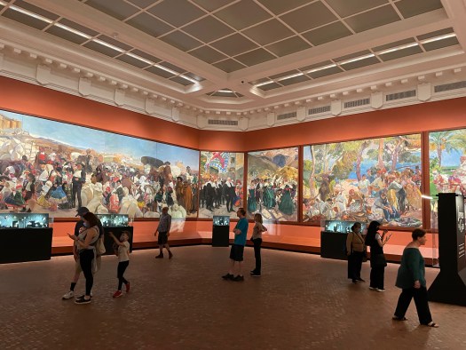
The New Museum has re-opened with an absolute banger of a show. But, funnily enough, I can never remember what it’s called. I keep telling people it’s “The future of humanity something something something.” In reality, the show is called “New Humans: Memories of the Future.”
The whole expanded building is jam-packed, overstuffed, even, with different artistic takes on man — sorry, ‘human’ — and machine, human and nature, cities… it’s almost too big of a theme to make for any kind of coherent exhibit, especially for a museum of contemporary art. It’s encyclopedic in ways that New Museum shows historically weren’t. It’s got pieces in it from the 1800s, for heaven’s sake — the polar opposite of “new.” With that vague “future anything” conceit, practically anything could be included. And given the vast space, practically everything was.
The curators leverage the museum’s old and new spaces well — I never felt lost, for all that I did feel like I was taking in a lot. I especially enjoyed a narrow, intensely cobalt blue, space that told a capsule history of the early days of computer art. Again, it surprised me the New Museum did it, that 80s-era stuff is resolutely memories of the past at this point, not the future. But I enjoyed it just the same.

The show mixed very cerebral and political takes on being human with crowd

pleasers (an HR Giger alien, an inexplicably skinned E.T.) It was jarring in an interesting way to see a monumentally important piece like Jacob Epstein’s “The Rock Drill” from 1913 just a couple of rooms away from Simon Denny’s jokey 2019 sculpture that realizes a sketch from an actual Amazon patent for a cage to keep human warehouse workers safe from their robotic co-workers (to be clear, the human goes in the cage, not the robots).
What’s the New New Museum For?

Despite its vast ambiguity, I really liked… I’ve already forgotten the name again. Future…Humans? It offered lots to think about, balancing visions of the future of humanity from the present with ones from the 1910s, 1960s and even the 1880s. It was comprehensive, reflective, and well curated. Was all of it perfectly on-theme? No, it sprawled too much for that. But if I were a New Museum curator I’d be reveling in having the space to sprawl, and I’d be itching to attempt something this big. It was super serious and academically impeccable.
It was the least contemporary show I’ve ever seen at the New Museum.

Indeed, my slightly snarky take after seeing it was that it felt like a MoMA show, not a New Museum show. Nobody goes to the New Museum for deep historical context. At least, they didn’t at the Old New Museum. To me, the New Museum is supposed to be gonzo and over-the-top and strident and its shows are supposed to make me a little angry. I hope future shows will get back to doing that. New York already has one MoMA, and one is enough. (And, yes, I’m counting the Guggenheim.)
So, here’s hoping that after this show the New New Museum goes back to being very contemporary, hip and edgy, off-the-wall.
Should you visit the New Museum?

I return to my opening notion that the New Museum needs to rebrand. But what would it more accurately call itself? The Newish Museum (rhymes nicely with the Jewish Museum)? The So-Called New Museum? When I have a better idea, I’ll email them.
The New Museum is good at its job. Anyone with an interest in art, and particularly contemporary art, should go, with a caveat. Given the lack of permanent collection, once Future Humans (or whatever) ends, your mileage will vary depending on what is filling all that space on The Bowery.
New York offers a surfeit of places to see contemporary art. If whatever the New Museum’s curators are doing doesn’t excite you, I’d recommend MoMA’s Queens outpost, PS1 over the New Museum. It’s a great old building for new art. Or the Whitney makes a good choice, and you get the High Line as a chaser. Or you could always spend an afternoon visiting galleries in Chelsea.
That said, if you’re just a tiny bit conservative and you like art that pushes your buttons, riles you up, even ticks you off, I can almost guarantee that whatever’s on at the New Museum will do that better than any other institution in New York. (Barring a Whitney Biennial.) If you’re super progressive and want to find a fortress of your people in embattled times, the New Museum is definitely that.
Fans of contemporary architecture should also visit. Although I didn’t love the original 2007 New Museum building from SANAA, I respected its defiant eccentricity. A stack of boxes that resolutely refused to check the boxes of required museum features. The new addition makes the whole New Museum more user friendly and easier to navigate, in addition to adding many square feet of space. It’s also an interesting example of a very contemporary intervention grafted onto an already very contemporary original building, something that doesn’t happen all that often.

The Twentieth Century
I can’t end without mentioning my runner-up “best thing I saw or learned” at the New Museum. Ironically (or maybe not), it was one of the oldest things in the exhibition.
Albert Robida was a French cartoonist who lived from 1848 until 1926. In 1883, he published a series of cartoons titled Le Vingtième siècle (The 20th Century). The New Museum show includes a series of these delightful science-fictional visions of life in the coming century. The most on-point image is “The Tramway at the Louvre Museum.” It’s absolutely a memory of the future. A sharp, witty comment on mass tourism, how people (mis)use museums, and how tech disrupts the way we interact with art. Look at the happy tourists, zipping from photo op to photo op and then on to the next landmark or monument. Sometimes the old and the new are actually the same thing.

For Reference:
| Address | 235 Bowery (near Prince Street), Manhattan |
|---|---|
| Website | newmuseum.org |
| Cost | General Admission: $25 (pay what you wish on Thursday evenings) |


 I want to break my rule and say that the whole building is my favorite thing about the Frick, but if I had to pick just one thing, I’m so happy to get to visit the Garden Court again. It’s lovely, green, and a respite when you need a minute away from the art.


 The biggest change from the old Frick is the second floor. Formerly offices of the museum staff, and before that the family’s private living spaces, the Frick has reclaimed a series of upstairs rooms for art. Everything about them is fantastic, although I do worry that they’re so intimate that crowd control will prove a challenge.
 Perhaps my biggest surprise — shock even — at the new Frick was a bowl of buttons at the member preview. Some bore the classy old-school “HCF” monogram logo, which, thankfully, The Frick has not thrown out in favor of some sort of superflat sans serif font. But the other buttons read, “FRICK YEAH!” If I’d been wearing pearls I would’ve immediately clutched them. Kudos to the marketing team for making a joke I never thought I’d see The Frick willingly make about its august founder’s surname.


 It’s lame to pick the obvious crowd-pleaser, but I loved the centerpiece picture in the Il Lee show. IW-2201, 2012 is a big oil and acrylic work. Here’s a detail, a larger picture is in the review, below. Photos do not do it justice, though.


 Funnily enough, Il Lee also loaned the Vilcek Foundation several bags of pens. Apparently he keeps every one he’s ever worked with. Those are on display in a plexiglas box in the middle of the ground floor gallery space. I’m a big fan of art that elevates humble materials, and there are few more humble than a Bic pen.


 The Super Bowl exhibit’s walk down advertising memory lane was deeply nostalgic to me. Amid Cindy Crawford selling Pepsi and a baby selling a brokerage, Apple’s 1984 ad, introducing the Mac, stands out as possibly the most revered commercial of all time. Also, why did anyone think Spuds McKenzie was a good idea?
 In 1991, the institution renamed itself the Museum of Television & Radio, since even then increasing amounts of TV was distributed in ways that had nothing to do with “broadcasting.” The same year the museum moved into a fun, Philip Johnson-designed post-modernist building, which is meant to resemble an old-timey radio.
 he current iteration of the Paley Museum doesn’t have a permanent collection, although there are a few adorable antique TV sets on display in the library. Instead, it hosts temporary exhibitions on timely topics. To wit, when I visited in early February, the Super Bowl. And, in a nod to Black History Month, props and costumes from the Nat Geo “Genius” miniseries about Malcolm X and Martin Luther King, Jr., in a modest second floor gallery.

 The curators took a sensible chronological approach, with stats on each of the LVIII games along the top (who played, final score, TV audience size). Wall texts offered details on how the Super Bowl evolved, with images and video. Artifacts livened things up: balls and jerseys, helmets, playbooks, and, climax of the exhibition, the actual Vince Lombardi Trophy. (A reproduction belonging to the New York Giants was on display the day I visited, as the actual Trophy had important duties off in Vegas.).


 Then again, the town of Bethpage on Long Island, which for some reason feels qualified to weigh in on New York City museums, rated the Paley Center a “best museum and best children’s party place” in New York in 2023. So…you may want to take that into account as you evaluate whether you should visit.
 When I discovered New York was getting a Museum of Broadway my first reaction was “Wait, why don’t we have one of those already?” It seems an obvious and overdue subject for a New York museum. I felt a little on the fence about it given my aversion to “museum in name only” experiential entertainment offerings. If they hand out flyers for it in Times Square, and charge $69 for “daily anytime entry,” can it be a legitimate museum? But, I figured I should take a look.
 The timeline panels are text heavy and extremely detailed. Some of the early ones distinguish between plays and musicals, but later panels tend to run together, as though the curators realized they were running out of both time and space. No sane visitor has a prayer of reading all of them. Rather, I suppose, you just look for things that catch your eye, favorite shows or stars, or key moments in Broadway history.


 The timeline sequence is quite long, taking up the first two floors of the museum. Eventually visitors arrive at the present, which features a model set for “Wicked” and a couple of costumes from “Hamilton.” That makes this the most self-referential entry yet on the


 The Museum of Broadway was created with passion and love — obsession may not be too strong a word — for its subject. This is a place geared for people who love the theater, and who already know something about it. On the other hand, total novices may be bewildered or bored. Moreover, although worlds better than those cynical, experiential quasi-museums that separate tourists from their money, this is unquestionably one of New York’s most expensive museums.


 Camino’s work reminds me of early 20th century jewelry by Lalique or Cartier. It draws heavily on nature, but also has a healthy dose of humor. I don’t know who would want enamel and gold earrings lovingly shaped into popcorn, but I respect that person.


 The main show at Fotografiska when I visited celebrated the photography of hip hop, which is turning 50 years old this year. (Exact birthdate: August 11, 1973.) The show was organized into five zones: an origins section, three geographic sections (East Coast, West Coast, and Southern, naturally), and a “hip hop today” closer. While breezy, hagiographic wall text introduced each section, there wasn’t a lot beyond that, and I really wanted more exposition.


 Many years ago I saw Punt e Mes listed on a menu at a fancy cocktail bar described along the lines of “If you know, you know.” Punt e Mes is an excellent Italian vermouth. Its name is dialect for punto e mezzo, a point and a half— meaning one part bitter, half a part sweet. This poster elegantly depicts the concept. If you didn’t know before, now you do.

 , and huge windows. A hallway widens into a smaller rear gallery, passing a beautiful modern kitchen with a plethora of Pantone espresso cups. Offices and a coat room are tucked behind discreet doors.
 The exhibition when I visited the Center for Italian Modern Art focused on posters made between the 1920s and the 1950s. It examined the interplay between the worlds of high art and commercial advertising, starting with the Italian futurists and cubists. It concluded with two pieces by Mimmo Rotella, who was something of an Italian anti-Warhol, taking actual posters and folding, spindling, and mutilating them into artworks that say things about capitalism and consumerism. Not generally positive things.
 The show also included a poster by Lucio Fontana, who is far better known as an artist than a graphic designer. His 1935 poster for Lloyd Triestino ship lines sleekly conveys speed and modernity. And it also hints at the linear slashes in canvas that would later make him famous. (Apologies for the inadvertent selfie in my photo.)
 That said, I was extremely impressed with the curation of the poster show — not to mention the beauty of the pieces they selected. Flipping through CIMA’s past catalogs left me vexed that I missed this place on my initial list of New York museums. On the brighter side, I’m happy that I know about it now. I will keep an eye on CIMA and I’m looking forward to seeing what it puts on next.