| Edification value | |
|---|---|
| Entertainment value | |
| Should you go? | |
| Time spent | 83 minutes |
| Best thing I saw or learned |  Many years ago I saw Punt e Mes listed on a menu at a fancy cocktail bar described along the lines of “If you know, you know.” Punt e Mes is an excellent Italian vermouth. Its name is dialect for punto e mezzo, a point and a half— meaning one part bitter, half a part sweet. This poster elegantly depicts the concept. If you didn’t know before, now you do. Many years ago I saw Punt e Mes listed on a menu at a fancy cocktail bar described along the lines of “If you know, you know.” Punt e Mes is an excellent Italian vermouth. Its name is dialect for punto e mezzo, a point and a half— meaning one part bitter, half a part sweet. This poster elegantly depicts the concept. If you didn’t know before, now you do. |
UPDATE: JUNE 19, 2024
I’m super bummed to report that the Center for Italian Modern Art is closing as of June 22, 2024. I only made it to the one exhibit there, so I guess it’s in part my fault for not knowing about it sooner or visiting more often once I did know about it. Keeping my review here for posterity’s sake.
Knowledge Gap
How did I not know about the Center for Italian Modern Art? I love Italy and I love art. I am reasonably fond of modernity. And centers are generally okay with me, too. This is one of those places that has been quietly doing cool things just a bit under my radar. In fact, I only know about it because I received a Poster House email announcing a tour of the current exhibit.

The Center for Italian Modern Art (inevitably, “CIMA,” but at least it’s pronounced “chee-ma”) occupies a light-filled fourth floor SoHo loft space. I expect it is a coincidence that it’s just around the corner from the last vestiges of Manhattan’s Little Italy, which has been eroding steadily since well before I moved to New York City. Still, it’s an interesting confluence of things Italian.

CIMA’s exhibition space is compact, consisting mainly of a gallery area that boasts lovely wood floors, an appropriately sleek and modern ornamental fireplace , and huge windows. A hallway widens into a smaller rear gallery, passing a beautiful modern kitchen with a plethora of Pantone espresso cups. Offices and a coat room are tucked behind discreet doors.
Although limited in square footage, it’s comfortable, with chairs and couches and that very nice kitchen lending a homey touch.
Posters Galore
 The exhibition when I visited the Center for Italian Modern Art focused on posters made between the 1920s and the 1950s. It examined the interplay between the worlds of high art and commercial advertising, starting with the Italian futurists and cubists. It concluded with two pieces by Mimmo Rotella, who was something of an Italian anti-Warhol, taking actual posters and folding, spindling, and mutilating them into artworks that say things about capitalism and consumerism. Not generally positive things.
Arranged chronologically, the exhibition touched on tremendous changes in advertising from the pre-war period, the rise of Italian Fascism, and through to postwar reconstruction.
Although there was little in the way of wall texts, CIMA is part of the growing network of organizations that leverage the Bloomberg Connects app, and so offered descriptions of key pieces via mobile. There was also a catalog for sale.
I want to go on about the variety of techniques Italian midcentury poster designers used (some cool photomontages here). I could also reflect on the changing dynamics between corporate brand identities and creative artistic impulses But mostly I want to rave about how awesome these posters were. Not to fixate on alcohol, but an early, cubist-inflected Campari advertisement definitely caught my eye.

 The show also included a poster by Lucio Fontana, who is far better known as an artist than a graphic designer. His 1935 poster for Lloyd Triestino ship lines sleekly conveys speed and modernity. And it also hints at the linear slashes in canvas that would later make him famous. (Apologies for the inadvertent selfie in my photo.)
I could go on… I haven’t even mentioned Olivetti yet, and that’s a shame. Only an Italian company could make a typewriter into a fashion accessory.
Andare o non andare?
The Center for Italian Modern Art puts on two shows a year. Its hours are limited and moreover it requires an appointment, so no just dropping in spontaneously in the midst of a SoHo shopping spree. Its smallish space means anything CIMA does will be focused and fairly limited in scope.
 That said, I was extremely impressed with the curation of the poster show — not to mention the beauty of the pieces they selected. Flipping through CIMA’s past catalogs left me vexed that I missed this place on my initial list of New York museums. On the brighter side, I’m happy that I know about it now. I will keep an eye on CIMA and I’m looking forward to seeing what it puts on next.
Anyone who likes cose italiane, or modern art, should look out for this place as well.
For Reference:
| Address | 421 Broome Street, 4th Floor, Manhattan |
|---|---|
| Website | https://www.italianmodernart.org/ |
| Cost | General Admission: $10; $15 for a tour. All visits by appointment only |
| Other Relevant Links |

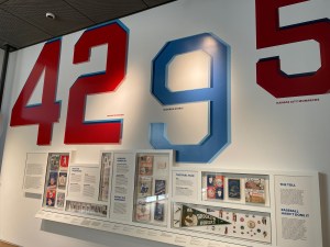 If instead I had grown up in Brooklyn and been a fan of baseball, the number 42 would’ve had a similarly huge and cosmic significance. It was Jackie Robinson’s number when he played for the Brooklyn Dodgers from 1947 to 1956.


 The Children’s Museum of the Arts is my first review of a New York children’s museum. While I like to think I’m unusually immature for my age, I feel I should have an actual member of the intended audience help calibrate my impressions of these places. And so I enlisted the aid of an eight-year-old friend, whom I’ll call “Zed,” and his mom, who kindly visited with me. Thanks!

 This place is primarily an activity center; I’m almost a little skeptical of calling it a “museum.” But it does have some art installations. Indeed, the open connector space between the various activity studios housed an exhibit on called “Ornamentation and Other Refrigerator Magnets” by Ellen Harvey. I found it quite clever, although I think it’s a little more to a grown-up’s taste than a kid’s. For example, there’s a witty display of books riffing on modernist architect Adolph Loos’s lecture on “ornament and crime,” perched on the fanciest shelves imaginable.
 I’d wager that most kids who visit this place don’t give the art a look at all. But engaging a kid in a conversation about stuff that’s fancy versus stripped down, and why some things are very decorated versus not so much, probably works well. It’s straightforward, and most kids will have some experience of that contrast, and possibly even an opinion about it.


 This incredible 1872 punch bowl and goblets, 36 pieces and 800 ounces worth (that’s 50 pounds! 22.68kg!) of sterling silver. A gift to Isaac Newton Marks, president of the New Orleans Fireman’s Charitable Association. It’s hard to see in the picture but the stem of each goblet is a fire fighter.
 The Fire Museum is like the attic of the New York City Fire Department. It’s where all the old interesting stuff is, and exploring it is very much like sifting through a collection of fire-related artifacts that someone at some point considered worth keeping.
  Gary Simmons’s “Ghost Reels,” an installation in the stairway featuring the names of black stars of the silent film era, written in the style of a typewriter typeface, and partially blurred or erased, evoking a part of film history that many have forgotten.
 The Drawing Center occupies a beautifully designed SoHo space, cast iron Corinthian columns outside, several gallery spaces within. It’s all very clean and spare and modern. Imminently Instagrammable, as they say.
 The Leslie-Lohman Museum occupies the newest museum space in the city, having moved into spiffy new digs in SoHo in just the last two weeks.
  The new space for the museum is mostly terrific. You enter into a fairly narrow area where two greeters welcome you and point out what’s on. There are two gallery spaces, a smaller one to the left as you walk in , and a larger one to the right and back. There’s also a kitchen space as well. I am torn between thinking it’s charming that there’s a kitchen right sort of in the open, and thinking their architect really should’ve found a way to separate that from the public space.
 The inaugural show is sort of a hodge-podge. I get that survey shows do that, and I would be disappointed if they’d segregated the gay art over here, the lesbian art over there, etc. Sorting by chronology or medium can oversimplify, too. But I would’ve appreciated some effort to put a lens on the collection. Love versus sex. Ideals of beauty. Something.
 Should you go? It depends on how you feel about diversity and penises. And maybe, even if you are squeamish about either of those two things, you should consider going anyway. It might be good for you.