| Edification value | |
|---|---|
| Entertainment value | |
| Should you go? | |
| Time spent | 210 minutes |
| Best thing I saw or learned |  I want to break my rule and say that the whole building is my favorite thing about the Frick, but if I had to pick just one thing, I’m so happy to get to visit the Garden Court again. It’s lovely, green, and a respite when you need a minute away from the art. I want to break my rule and say that the whole building is my favorite thing about the Frick, but if I had to pick just one thing, I’m so happy to get to visit the Garden Court again. It’s lovely, green, and a respite when you need a minute away from the art. |
My second-favorite museum in New York City
The Frick Collection has re-opened in its Fifth Avenue mansion after a multi-year, zillion-dollar expansion and renovation project. My pithy original review from 2017 is here, and my review of The Frick’s temporary home-away-from-home in the brutalist former Whitney, former Met Breuer building on Madison Avenue is here.
I loved the original Frick Collection for its extraordinary good taste, and for succeeding as simultaneously one of the best house museums and art museums in the City. I loved it for bucking museum trends and norms:
- Minimal wall text – just look at the art!
- No cafe
- No photos allowed (take that, Instagram!)
I worried when the big renovation project was announced. Would The Frick sacrifice the things that made it special?
Then, once the museum moved to its temporary space, I found I loved The Frick Madison. I thought the recontextualization of the collection was brilliant and I appreciated (though I did not always love) the opportunities that having the collection there created to let Mr. Frick’s art commune and converse with contemporary art. I was sad when it shut down.
But now The Frick is back, and the question on my mind is, is it still my second favorite museum in New York City? (If you’re curious, The Cloisters is number one..)
Short answer, if you’d rather not read this whole essay, is yes. And luckily enough, during the member previews for the new-old Frick this spring the museum waived its no-photo policy, so I can pepper this review with pictures.

Nothing but the best for Mr. Frick
I try to be careful about superlatives. If I like or dislike a thing subjectively, that’s not the same as something being objectively whatever. So, when I claim that The Frick Collection boasts not one but two of the very best roomfuls of art in New York City, that’s very conscious.

The first room is Mr. Frick’s Living Hall, which is home to an astounding set of pictures. Hans Holbein’s St. Thomas More and Thomas Cromwell, forever glaring at one another from opposite sides of the mantel. El Greco’s St. Jerome in between them. The monumental St. Francis by Giovanni Bellini on the opposite wall, flanked by two literal Renaissance Men. I imagine what Mr. Frick’s ego must’ve been like, that he could sit with this group of guys around him, and not be intimidated beyond all ability to work, live, think, converse.

The second room is the West Gallery, which is, I sincerely believe, painting for painting, the best single roomful of art in New York. What a flex this particular collection of masterpieces is. The Rembrandts. The Turners. The Velazquez. The Titians. The Vermeers, plural. There’s not a miss in the room. Any of them merit looking at for hours, for days.
And the thing is, The Frick has always had many other rooms that, depending on artistic tastes and preferences, could easily rank on a “best rooms” list. And the new Frick has a lot more of those rooms to love.
The new Frick takes it to the next level
The ground floor of The Frick Collection includes the public, formal spaces the Frick family dined and entertained in back in the day, with plus dedicated gallery space, a lovely glassed-over garden court, and an entry foyer added in the 1970s.

One reason for the renovation was to address a fairly major need for more space, for many reasons. The collection continues to grow, and The Frick was stuck hosting lovely little temporary exhibits in very inadequate basement space. The gift shop was possibly literally located in Mrs. Frick’s former broom closet. The Frick held concerts in a room that decidedly did not live up to the rest of the building. All these issues are now addressed, and then some.
 The biggest change from the old Frick is the second floor. Formerly offices of the museum staff, and before that the family’s private living spaces, the Frick has reclaimed a series of upstairs rooms for art. Everything about them is fantastic, although I do worry that they’re so intimate that crowd control will prove a challenge.
Frick newbies will take it in stride, but for Frick veterans there’s a fun frisson of trespassing when you go up that grand staircase the first time. While the Frick was in previews, they discovered the low risers and carpeting make the mansion’s staircase a little treacherous to descend, so they are up-only. Fortunately, there’s an awesome marble stairway in the new addition that safely returns you to earth again.

Addressing all The Frick’s former problems, the new addition also offers:
- Much bigger and better space for temporary exhibits
- A fancy cafe
- New space to show drawings and works on paper
- A beautiful subterranean theater (I can’t wait to hear a concert there)
- A gift shop that definitely does not resemble a broom closet.
The Shape of Fricks to Come
We don’t live in a world where things get better. Entropy is the rule, change inspires skepticism rather than hope. But sometimes, against the odds, change improves, reinvents, opens new doors, or new floors. At least in museums. The new-old Frick Collection is better than it used to be.
 Perhaps my biggest surprise — shock even — at the new Frick was a bowl of buttons at the member preview. Some bore the classy old-school “HCF” monogram logo, which, thankfully, The Frick has not thrown out in favor of some sort of superflat sans serif font. But the other buttons read, “FRICK YEAH!” If I’d been wearing pearls I would’ve immediately clutched them. Kudos to the marketing team for making a joke I never thought I’d see The Frick willingly make about its august founder’s surname.
I do have one reservation. I was excited about the restoration of the old gallery spaces, putting the collection back “exactly as it was.” Except, it isn’t. Not quite. The Frick has pulled off a super subtle intervention throughout, a temporary installation of dazzlingly realistic porcelain flowers by Vladimir Kanevsky, a Ukrainian-born contemporary artist. These play off The Frick’s art, sometimes too well. They reflect The Frick’s own amazing porcelain collection. AND they offer a nod to beleaguered Ukraine. Well played, curators.
But. But but but. That’s some new art snuck into in the old spaces. And a bit of me raises a skeptical eyebrow, reaches for my metaphorical pearls again. Just because this sneaky, subtle art intervention succeeds (really well!), that doesn’t mean the next one will. And I bet in this edgy, brave new Frick, there will be others. So, we’ll see.

That off my chest, I refuse to end pessimistically. Everyone should go to The Frick Collection. It’s both wonderful and essential. And now it’s a whole new Frick, and yet it’s also the old Frick, and I can’t wait to see what it does next. “Frick yeah,” indeed.

For Reference:
| Address | 1 East 70th Street (between 5th and Madison), Manhattan |
|---|---|
| Website | frick.org |
| Cost | General Admission: $30, advance timed tickets essential |
| Other Relevant Links |
|
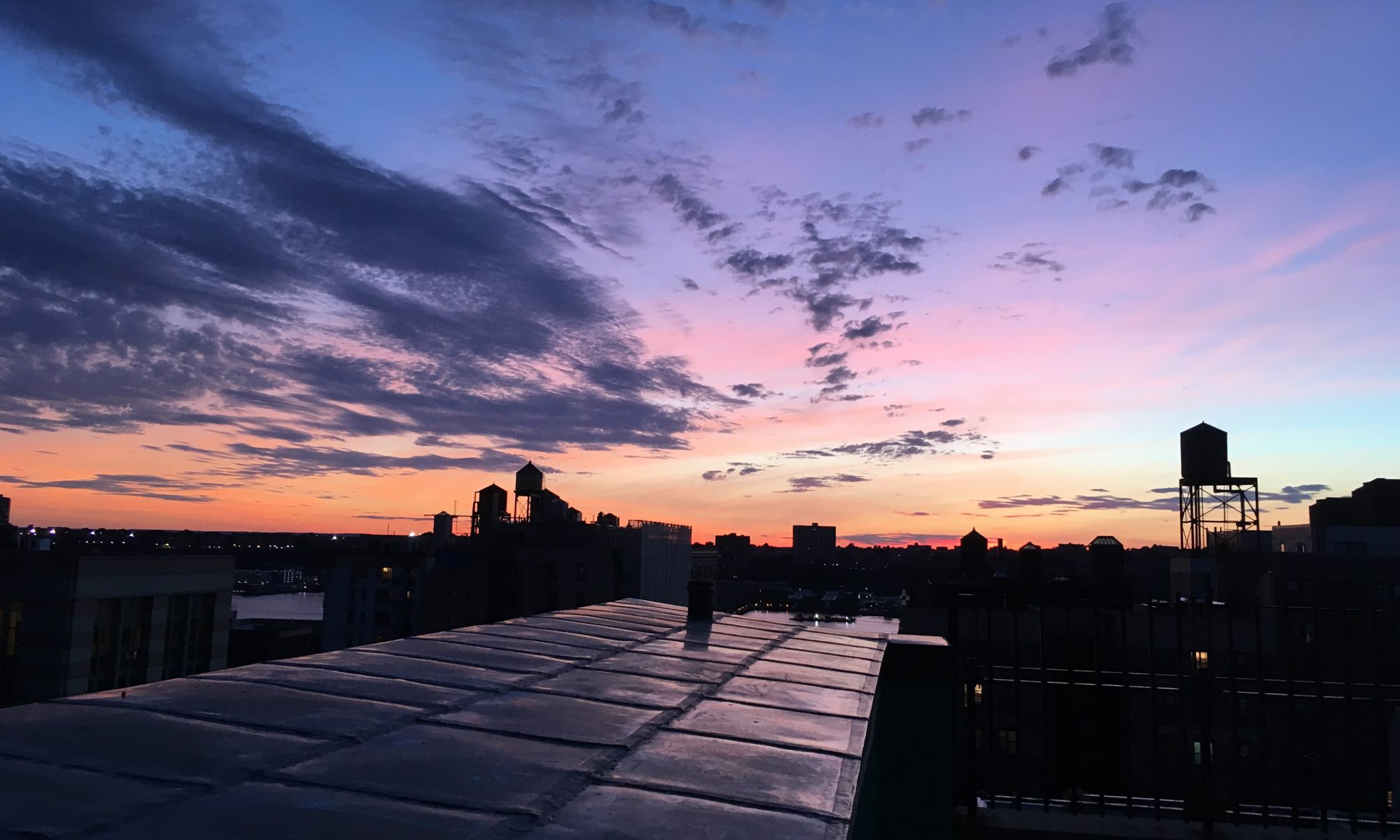


 Temple Emanu-El is a beautiful, imposing synagogue, one of several great houses of worship on the green stretch of Fifth Avenue opposite Central Park. The temple itself is shut tight like a fortress between services, However, if you go around to a side entrance on East 65th Street and ask the guard, you can visit the Herbert & Eileen Bernard Museum, which hosts temporary exhibits on various aspects of Jewish life, faith, and culture.
 The first time I visited the Jewish Museum, in July of 2017, it was in the midst of re-installing its permanent collection, taking a floor and a substantial part of the reason to visit offline. I had doubts concerning the temporary shows on at the time— odd curatorial decisions, highly esoteric subject matter and general kitschiness all nudged me away from strongly recommending the museum.
 Max Vityk’s “Outcrops” series of tactile, colorful, geologic abstract paintings installed in the third floor library and dining room. Sometimes abstract art clashes with classical decor, but these go better than they have any right to. Compliments to the curator for a beautiful installation.


 First Floor: A brief introduction to Ukraine, the place, its people, history and culture. It includes a nice touchscreen display for those who want a deeper dive, and an overview of notable Ukrainian Americans.


 The Cooper Hewitt Museum is the Smithsonian Institution’s branch devoted to design. It started out under the guardianship of Cooper Union, which closed it in the 1960s. The Smithsonian then adopted it and it opened in its current location in the 1970s. (There’s a second Smithsonian branch in New York: the Museum of the American Indian, in Lower Manhattan.)


 The digital tables appeal, too, inviting visitors to “grab” random objects with their pens and trace their way through the museum’s collection by material, theme, function, or era. Visitors can also use the pen to take a stab at designing something of their own.


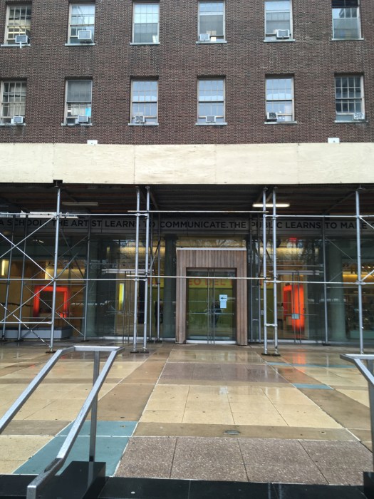 El Museo del Barrio is currently the northernmost of the “Museum Mile” museums, occupying a stately building on Fifth Avenue, just across 104th Street from the Museum of the City of New York. According to its website, it started in the early 1970s as a cultural center focused on Puerto Rico. It has since expanded its focus to cover all Latin American and Caribbean art and artists. After bouncing around East Harlem a bit it found its current home in the Heckscher Building in 1977.
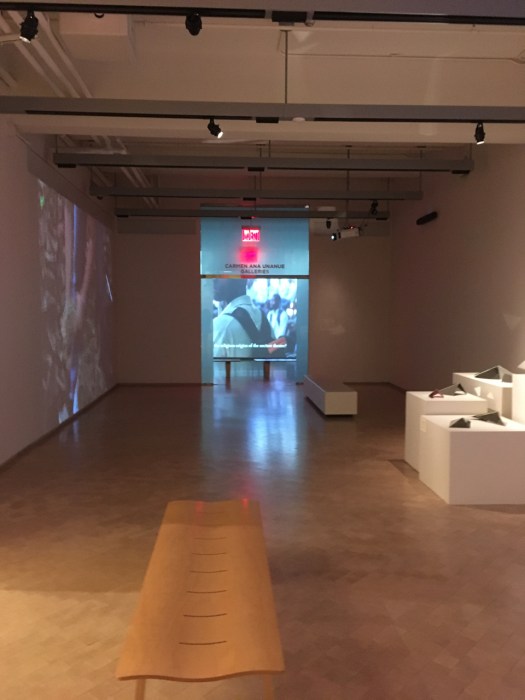 The main show when I visited was of video art by Beatriz Santiago Muñoz, as well as selections she chose from the museum’s permanent collection. I run hot and cold with video art. On the one hand, two of the best, most memorable works of art I’ve seen in the past two years were video pieces. On the other hand, I am bored to tears with the vast majority of it. Muñoz’s work, largely non-narrative, did little for me. I lacked the eye or knowledge to understand how her selections from the permanent collection clicked with what she’s trying to do.
 The other show featured recent acquisitions, definitely a common and valid theme for a museum, although given the small space available, I didn’t find it very edifying as far as key current trends in Latin or Caribbean art. I liked some of the pieces, but I also thought much of the work on view wasn’t especially “Latin.”


 The Museum of the City of New York is an absolute treasure. It occupies a really lovely Georgian/Federal-style building at the northern end of Museum Mile on Fifth Avenue. The Museum started out its life in
  For all that it’s merely fake old, it’s got one of the best staircases of any museum in the city, a super-elegant curve leading up from the ground floor. Nowadays complemented by a terrific light sculpture.

 on a rotating basis. Interact with a character and you get more, potentially much more, about them and their contribution. And it’s not just human characters, you can find out about players like beavers and oysters, too. I’m often skeptical of the value of these kinds of things. Too often they are more sizzle than steak. But this impressed me a lot.

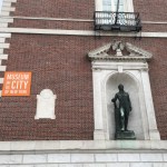 And finally, as I do wherever I can, I will mention Alexander Hamilton, who is present, larger than life size, on the facade.