| Edification value |  |
|---|---|
| Entertainment value |  |
| Should you go? | |
| Time spent | 53 minutes |
| Best thing I saw or learned |
 The Super Bowl exhibit’s walk down advertising memory lane was deeply nostalgic to me. Amid Cindy Crawford selling Pepsi and a baby selling a brokerage, Apple’s 1984 ad, introducing the Mac, stands out as possibly the most revered commercial of all time. Also, why did anyone think Spuds McKenzie was a good idea? The Super Bowl exhibit’s walk down advertising memory lane was deeply nostalgic to me. Amid Cindy Crawford selling Pepsi and a baby selling a brokerage, Apple’s 1984 ad, introducing the Mac, stands out as possibly the most revered commercial of all time. Also, why did anyone think Spuds McKenzie was a good idea? |
Once Upon a Paley
Once upon a time, New York City was home to a Museum of Broadcasting. In 1975, William S. Paley founded an institution to preserve TV and radio programming. (The other company he founded was CBS.) In 1976, his Museum of Broadcasting opened its doors. “Broadcasting” feels like a technological fossil these days, appropriate for a museum. But it was the heart and soul of society in the late 20th century.
 In 1991, the institution renamed itself the Museum of Television & Radio, since even then increasing amounts of TV was distributed in ways that had nothing to do with “broadcasting.” The same year the museum moved into a fun, Philip Johnson-designed post-modernist building, which is meant to resemble an old-timey radio.
In the early 2000s the museum rebranded as the Paley Center for Media. For a decade or so it offered a library and an event space known for putting on interesting talks with the television creators and stars. Recently, however, the Paley Center re-opened its museum, so of course I visited.
The Paley Center today has a medium-sized gallery space on its ground floor, and a small space upstairs. It’s also home to a video game gallery (available for rental for kids’ parties) and a library containing video monitors where visitors can access any of 160,000 television and radio programs and ads in the collection. So, it’s kind of like Hulu.
T he current iteration of the Paley Museum doesn’t have a permanent collection, although there are a few adorable antique TV sets on display in the library. Instead, it hosts temporary exhibitions on timely topics. To wit, when I visited in early February, the Super Bowl. And, in a nod to Black History Month, props and costumes from the Nat Geo “Genius” miniseries about Malcolm X and Martin Luther King, Jr., in a modest second floor gallery.
The Gridiron

The Super Bowl took over the Paley Center the day I visited, one week before the Chiefs and 49ers faced off. The entry space featured a huge video screen showing highlights of halftime musical performances, and the elevator lobby was fully wrapped, and included Katy Perry’s halftime show outfit (from XLIV), along a shark and a beach ball.
As befits a museum of broadcasting, the exhibit was less about the game of football itself, and more about the unofficial secular holiday and cultural phenomenon the Super Bowl has evolved into, with growing mass audiences, iconic advertising, and the previously mentioned halftime show spectacular, all getting at least as much attention as the games themselves.
 The curators took a sensible chronological approach, with stats on each of the LVIII games along the top (who played, final score, TV audience size). Wall texts offered details on how the Super Bowl evolved, with images and video. Artifacts livened things up: balls and jerseys, helmets, playbooks, and, climax of the exhibition, the actual Vince Lombardi Trophy. (A reproduction belonging to the New York Giants was on display the day I visited, as the actual Trophy had important duties off in Vegas.).

Downstairs, another space featured a selection of game balls, as well as a chunk of the set from the Super Bowl LV Halftime Show, with a choice of sparkling red jackets, should visitors wish to cosplay as The Weeknd. I did not see anyone do that while I was there. And the Paley Center’s theater ran historic Super Bowl games and/or ads, in case visitors wanted to revisit past high points.

Curatorial Questions
The exhibition was co-presented by the NFL and the Pro Football Hall of Fame. I suspect that is why all signs of Super Bowl controversy were scrubbed out of the narrative. Janet Jackson and Justin Timberlake were absent from the big halftime show screen. Not a word about concussions, either. Or team names that seem leftovers from an earlier, cruder era.
The exhibit made much of the patriotism of Super Bowl XXXVI in 2002. 9/11 casualties’ names streamed on a screen behind U2 at Halftime, which feels a little cringe-y now. However, it said nothing about players taking a knee during the National Anthem in the wake of Black Lives Matter. Ironic, given that Black History Month was the other thing the Paley Center was ostensibly honoring when I visited.
I would have hoped for some acknowledgement that the Super Bowl isn’t an unalloyed marvel. It’s possible to celebrate something even while acknowledging its flaws, and their exclusion is a notable miss.

Should you visit the Paley Center Museum?
Unless you’re an old-school TV fan, or some sort of insane museum completist, it’s hard to recommend the Paley Center. Twenty bucks is a high price for the relatively small museum space, so it’s not worth just dropping in.
The institution knows its mass-media subject better than just about anyone else. But its “rah-rah, no problems here” approach to the Super Bowl exhibit, although fun, raises questions of objectivity and curation. Even if a future exhibition subject were to interest me, I’d wonder who was shaping the content, and what kind of slant it might have.
If you want a museum of popular culture, the Museum of Broadway in Times Square, the Museum of the Moving Image in Queens and the exhibit spaces at the Performing Arts Library at Lincoln Center are all far more worth your time and money.
 Then again, the town of Bethpage on Long Island, which for some reason feels qualified to weigh in on New York City museums, rated the Paley Center a “best museum and best children’s party place” in New York in 2023. So…you may want to take that into account as you evaluate whether you should visit.
The Paley Center’s library of 160,000 old television shows and commercials was revolutionary in the early 90s. In today’s world of infinite streaming, it’s much less impressive. Speaking of old commercials, it reminds me of this 1999 ad from a long-defunct phone company. I suspect there’s much old television programming on the Paley Center hard drives that’s not available anywhere else. Maybe there are lost treasures waiting for a reboot. Or maybe it’s just a lot of poorly acted, standard definition time wasters brimming with casual racism and outdated views of women. I think I’ll stick with Hulu.
For Reference:
| Address | 25 West 52nd Street, Manhattan |
|---|---|
| Website | https://www.paleycenter.org/ |
| Cost | General Admission: $20 |
| Other Relevant Links |
|



 When I discovered New York was getting a Museum of Broadway my first reaction was “Wait, why don’t we have one of those already?” It seems an obvious and overdue subject for a New York museum. I felt a little on the fence about it given my aversion to “museum in name only” experiential entertainment offerings. If they hand out flyers for it in Times Square, and charge $69 for “daily anytime entry,” can it be a legitimate museum? But, I figured I should take a look.
 The timeline panels are text heavy and extremely detailed. Some of the early ones distinguish between plays and musicals, but later panels tend to run together, as though the curators realized they were running out of both time and space. No sane visitor has a prayer of reading all of them. Rather, I suppose, you just look for things that catch your eye, favorite shows or stars, or key moments in Broadway history.


 The timeline sequence is quite long, taking up the first two floors of the museum. Eventually visitors arrive at the present, which features a model set for “Wicked” and a couple of costumes from “Hamilton.” That makes this the most self-referential entry yet on the


 The Museum of Broadway was created with passion and love — obsession may not be too strong a word — for its subject. This is a place geared for people who love the theater, and who already know something about it. On the other hand, total novices may be bewildered or bored. Moreover, although worlds better than those cynical, experiential quasi-museums that separate tourists from their money, this is unquestionably one of New York’s most expensive museums.



 Camino’s work reminds me of early 20th century jewelry by Lalique or Cartier. It draws heavily on nature, but also has a healthy dose of humor. I don’t know who would want enamel and gold earrings lovingly shaped into popcorn, but I respect that person.


 The main show at Fotografiska when I visited celebrated the photography of hip hop, which is turning 50 years old this year. (Exact birthdate: August 11, 1973.) The show was organized into five zones: an origins section, three geographic sections (East Coast, West Coast, and Southern, naturally), and a “hip hop today” closer. While breezy, hagiographic wall text introduced each section, there wasn’t a lot beyond that, and I really wanted more exposition.


 Many years ago I saw Punt e Mes listed on a menu at a fancy cocktail bar described along the lines of “If you know, you know.” Punt e Mes is an excellent Italian vermouth. Its name is dialect for punto e mezzo, a point and a half— meaning one part bitter, half a part sweet. This poster elegantly depicts the concept. If you didn’t know before, now you do.

 , and huge windows. A hallway widens into a smaller rear gallery, passing a beautiful modern kitchen with a plethora of Pantone espresso cups. Offices and a coat room are tucked behind discreet doors.
 The exhibition when I visited the Center for Italian Modern Art focused on posters made between the 1920s and the 1950s. It examined the interplay between the worlds of high art and commercial advertising, starting with the Italian futurists and cubists. It concluded with two pieces by Mimmo Rotella, who was something of an Italian anti-Warhol, taking actual posters and folding, spindling, and mutilating them into artworks that say things about capitalism and consumerism. Not generally positive things.
 The show also included a poster by Lucio Fontana, who is far better known as an artist than a graphic designer. His 1935 poster for Lloyd Triestino ship lines sleekly conveys speed and modernity. And it also hints at the linear slashes in canvas that would later make him famous. (Apologies for the inadvertent selfie in my photo.)
 That said, I was extremely impressed with the curation of the poster show — not to mention the beauty of the pieces they selected. Flipping through CIMA’s past catalogs left me vexed that I missed this place on my initial list of New York museums. On the brighter side, I’m happy that I know about it now. I will keep an eye on CIMA and I’m looking forward to seeing what it puts on next.

 The Gilder Center is a very, very, very sexy building. It’d be easy to dismiss its biomorphic, asymmetrical forms as Flintstones architecture, or aping termites or some other social insect. And those are valid brickbats. But, seriously, look at these curves. This is the most Instagrammable new museum space New York has seen since someone last showed off a Yayoi Kusama Infinity Room.


 The Gilder Center also represents AMNH looking at itself via the view of the collections, and also literally, as new windows peer out at the red brick facade of the older building.

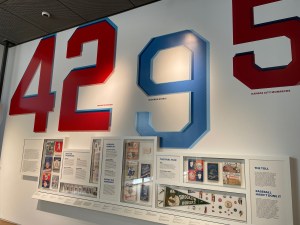 If instead I had grown up in Brooklyn and been a fan of baseball, the number 42 would’ve had a similarly huge and cosmic significance. It was Jackie Robinson’s number when he played for the Brooklyn Dodgers from 1947 to 1956.


 much of the show was a hit for me. It helped that most pieces in this show were lighthearted, clever, and often quite beautiful. For example, I loved Judy Fox’s slightly creepy, biomorphic, technicolor terra cotta pieces that looked like something out of a Jeff VanderMeer book.
 e entrance to one of the two Academy pavilions features a pair of handsome, old-school bronze doors, with naked cherubim and the personifications of Inspiration (girl) and Drama (guy), along with the sentiment, “By the gates of art we enter the temple of happiness.” However, the pediment of the same building bears a different perspective: “All passes, art alone untiring stays to us.”
 It’s a predictable choice but Hispanic Society’s Goya, “The Duchess of Alba,” from 1797, is a fantastic portrait. I especially love that Goya inscribed his signature on the sandy shore where she’s standing. The Duchess unsubtly points a bejeweled finger toward his name.


