| Edification value | |
|---|---|
| Entertainment value | |
| Should you go? | |
| Time spent | 60 minutes |
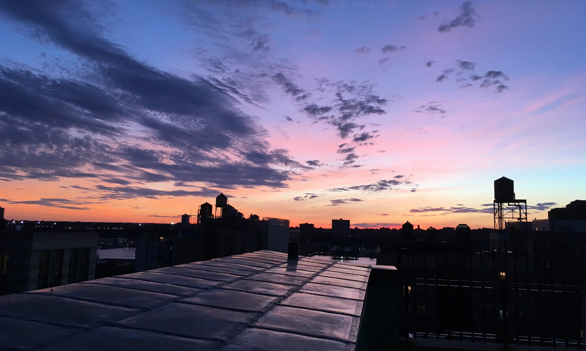
| Best thing I saw or learned | Sorolla’s entire mural series (which I write about below) was easily the best thing. However if I had to pick just one panel, I’d go with Seville/The Dance, which evokes Carmen… the happy, carefree parts, not the stabby misogynistic ones. My little internet photo does not do it justice!
|

Note: I first visited the Hispanic Society in May of 2022. I revised my review in July 2023 as the Society has continued its reopening. The original review is here.
Iberian Dreams…
Like many other institutions around New York City, the Hispanic Society of America was founded by a rich guy who became obsessed with something. Think Gustav Heye and what is now the New York branch of the Smithsonian’s Museum of the American Indian, or Mr. Frick’s collection or Mr. Morgan’s library… Occasionally it was an obsessed rich woman, like Jacques Marchais’s thing for Tibetan Art or the artistic passions of Gertrude Vanderbilt Whitney.
In the case of the Hispanic Society, the rich dude was Archer Milton Huntington. And the obsession was the art of the Iberian peninsula. Archer Milton Huntington opened his Spanish Museum in 1908, though he’d dreamed of having a museum of some kind since he was a boy. Born very rich, the story goes that as a young man Huntington fell in love with Hispanic art on a visit to Mexico, which sparked many trips to Spain, learning Spanish as well as Arabic, and becoming both a connoisseur of and an expert in the art and culture.

The Hispanic Society is located in a splendid Beaux-Arts building in Harlem, part of the Audubon Terrace campus. It’s an interesting quirk of fate that Spanish is much more likely to be spoken in the museum’s neighborhood today than when it opened there over a century ago. The beautiful old building is a blessing and a curse: the museum closed for a massive renovation shortly before I started my museum project back in 2017, and remained closed until 2022.
Recently, the Hispanic Society entered the second phase of its reopening, following the teaser “we’re back” exhibition that I saw in its basement last year.

Soto and Sorolla
The Hispanic Society has now reopened two spaces: its Main Court and the Sorolla Room. The Main Court has two levels (though only the ground floor is currently open) and is something like a roofed-over medieval cloister, featuring an open space surrounded by ornate archways and a small corridor running around the perimeter under the mezzanine. It is an exciting space, though its relatively small size limits what the Society can exhibit there.

Nevertheless, the cleverness of the Hispanic Society’s reopening exhibit belied its small space.
Joaquín Sorolla y Bastida was a famous Spanish painter (“the most esteemed and renowned Spanish painter of his era,” per a wall text) who died in 1923. Jesús Soto was a Venezuelan abstractionist who made highly formal geometric sculptures who was born in 1923. That coincidental birth/death centennial year provides a somewhat tenuous justification for exhibiting their work together. However, each artist was interesting in his own right, and together they bridge the old Hispanic Society/ new Hispanic Society philosophy regarding curation and collecting.
That philosophy, by the way, has evolved from a focus mainly on the Old World to including the New, and from classic and retrospective to embracing contemporary work.

I appreciated the way the Hispanic Society installed Sorolla’s bourgeois society portraits in the arches of its Main Court. Floating in space they echoed the 3D, geometric, sculptural layering of Soto’s work.

The Sorolla Room
The Sorolla Room is something else. Much like the Spanish Inquisition, I was not expecting it. Back in 1909, the Hispanic Society held the first major US exhibit of Joaquín Sorolla’s work. Based on the success of that show, Archer Milton Huntington commissioned Sorolla to create a series of murals depicting life in España, installed in the eponymous room.
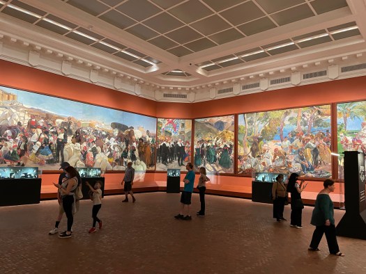
The murals are a delight — packed with regional detail. Colorful and exotic, they combine mundane scenes with holidays and festivals. I might feel concern that they’re a bit too exoticizing, but, hey, Sorolla was Spanish, I think it’s safe to assume he knew what he was painting. I want to take a guided tour of these murals, or at least come back and visit many more times.
The Hispanic Society installed another exhibit in the Sorolla room, entitled “Jewels in a Gem,” featuring the work of Luz Camino, a contemporary Spanish jewelry designer. This worked surprisingly well. The installation was designed to leave the murals unimpeded and the jewelry complemented what was on the walls — sometimes directly. For example, I appreciated the fishbone earrings in a case juxtaposed with a fish market scene.

 Camino’s work reminds me of early 20th century jewelry by Lalique or Cartier. It draws heavily on nature, but also has a healthy dose of humor. I don’t know who would want enamel and gold earrings lovingly shaped into popcorn, but I respect that person.
Although full of beautiful things, my one nitpick is the exhibit would have been richer had it included some of Camino’s notebooks, design sketches, and other preparatory work — I love seeing inside a designer’s creative process.

Should You Visit the Hispanic Society Museum?
I’m excited that the Hispanic Society has continued its return to life as a museum. Its important collection and beautiful building are invaluable restorations to the New York’s cultural fabric.
With this phase of its reopening, the Hispanic Society has gone from being “worth a quick stop if you happen to be in that part of Harlem” (quoting myself from 2022) to being well worth a trip. The Sorolla murals are arguably the closest thing Manhattan offers to a visit to Spain. (Mercado Little Spain at Hudson Yards is the other contender…)
The Hispanic Society would make a good combination with the splendid Morris-Jumel Mansion, both historic buildings. It is also close to the Sugar Hill Children’s Museum of Art and Storytelling if you’ve got kids in tow.

I chatted with a friendly guard who said that the Society expects to have more gallery space open by autumn. I’m already excited about making another visit.
Hopefully part of the longer-term plan will make the pleasant piazza of Audubon Terrace more inviting, too. An al fresco café or tapas bar would be fantastic there (where’s José Andrés when you need him?!). Sculptures on the terrace immortalize Don Quixote (yay), the conquistadors (boo), and El Cid (I think he’s a “yay” but your mileage may vary…). The terrace was once a sort of Lincoln Center of cultural institutions, featuring the American Indian Museum, the American Numismatic Society, and the American Academy of Arts and Letters. That last one is still there, and occasionally open for exhibitions, too.

For Reference:
| Address | 613 W 155th Street, Manhattan |
|---|---|
| Website | hispanicsociety.org |
| Cost | General Admission: Free |
| Other relevant links |
|


 The main show at Fotografiska when I visited celebrated the photography of hip hop, which is turning 50 years old this year. (Exact birthdate: August 11, 1973.) The show was organized into five zones: an origins section, three geographic sections (East Coast, West Coast, and Southern, naturally), and a “hip hop today” closer. While breezy, hagiographic wall text introduced each section, there wasn’t a lot beyond that, and I really wanted more exposition.


 Many years ago I saw Punt e Mes listed on a menu at a fancy cocktail bar described along the lines of “If you know, you know.” Punt e Mes is an excellent Italian vermouth. Its name is dialect for punto e mezzo, a point and a half— meaning one part bitter, half a part sweet. This poster elegantly depicts the concept. If you didn’t know before, now you do.

 , and huge windows. A hallway widens into a smaller rear gallery, passing a beautiful modern kitchen with a plethora of Pantone espresso cups. Offices and a coat room are tucked behind discreet doors.
 The exhibition when I visited the Center for Italian Modern Art focused on posters made between the 1920s and the 1950s. It examined the interplay between the worlds of high art and commercial advertising, starting with the Italian futurists and cubists. It concluded with two pieces by Mimmo Rotella, who was something of an Italian anti-Warhol, taking actual posters and folding, spindling, and mutilating them into artworks that say things about capitalism and consumerism. Not generally positive things.
 The show also included a poster by Lucio Fontana, who is far better known as an artist than a graphic designer. His 1935 poster for Lloyd Triestino ship lines sleekly conveys speed and modernity. And it also hints at the linear slashes in canvas that would later make him famous. (Apologies for the inadvertent selfie in my photo.)
 That said, I was extremely impressed with the curation of the poster show — not to mention the beauty of the pieces they selected. Flipping through CIMA’s past catalogs left me vexed that I missed this place on my initial list of New York museums. On the brighter side, I’m happy that I know about it now. I will keep an eye on CIMA and I’m looking forward to seeing what it puts on next.


 much of the show was a hit for me. It helped that most pieces in this show were lighthearted, clever, and often quite beautiful. For example, I loved Judy Fox’s slightly creepy, biomorphic, technicolor terra cotta pieces that looked like something out of a Jeff VanderMeer book.
 e entrance to one of the two Academy pavilions features a pair of handsome, old-school bronze doors, with naked cherubim and the personifications of Inspiration (girl) and Drama (guy), along with the sentiment, “By the gates of art we enter the temple of happiness.” However, the pediment of the same building bears a different perspective: “All passes, art alone untiring stays to us.”
 It’s a predictable choice but Hispanic Society’s Goya, “The Duchess of Alba,” from 1797, is a fantastic portrait. I especially love that Goya inscribed his signature on the sandy shore where she’s standing. The Duchess unsubtly points a bejeweled finger toward his name.


 The International Center of Photography is one of two photo-specialist institutions in New York (the other being the


 The gift shop also merits a bit more of a mention than I’ve given it — it’s quite good, and gives another impression of the slicker, more modern aspect of the interior design.


 He reminded me of the nameless canine taxidermied and memorialized at the


